Different Color Combinations
Achieving a stylish and attractive look for your home or wardrobe can be difficult to accomplish without the right color combination. The colors you choose and how they are arranged in an ensemble can make all the difference. As an interior designer, fashionista, or artist, it is important to understand how colors interact with each other and what combinations work together best. In this article, we will explore different color combinations and discuss the principles of creating a successful palette. Color is a powerful tool used by artists and designers to evoke emotion and create eye-catching designs. In fact, color combinations have the power to completely transform an image or design. While there are seemingly endless possibilities for color combinations, some of the most popular are complementary colors, analogous colors, split complementary colors, triadic colors, and monochromatic colors.
Color Wheel Theory
Color wheel theory is an important tool for anyone looking to create their own color palettes. This theory is based on the idea that certain combinations of colors make aesthetically pleasing designs and can create a desired effect in art, interior design, fashion and more. Knowing the basics of color wheel theory will help anyone create the best combinations of colors for their projects.
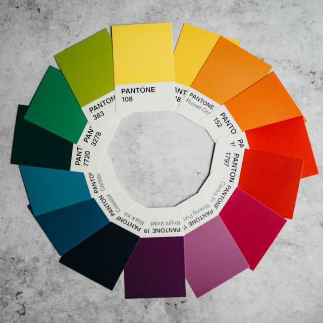
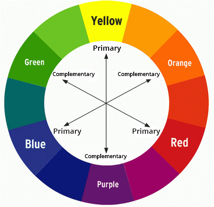
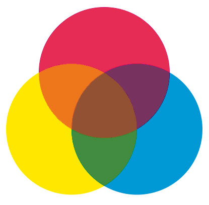
The color wheel consists of 12 distinct hues arranged in a circle around three primary colors: red, blue and yellow. Secondary colors are created by mixing two primary colors together while tertiary or intermediate shades are created by mixing one primary color with one secondary color. The use of complementary or contrasting hues can produce dramatic effects while analogous shades tend to be more subtle and soothing. Color harmony involves combining various hues from different places on the wheel in order to create balance and visual interest in a design piece.
Primary Colors
Primary colors are the three colors that provide the foundation for all other hues. They include red, blue, and yellow. Each of these colors can be mixed with each other to create a range of new shades and tones. Primary colors are often used in art, fashion, and design because of their versatility.
When paired together, primary colors create some of the best combinations of color. Red and yellow become orange; blue and yellow become green; red and blue become purple. These unique mixtures allow for endless possibilities when it comes to creating aesthetically pleasing designs or artwork.
The use of primary colors is not limited to just visual arts either – they can also be found in interior decorating as well as fashion accessories like jewelry or clothing items.

Secondary Colors
When it comes to color combinations, secondary colors can be a great option. However, deciding which ones to use together can be tricky. Understanding the basics of how colors interact with each other is key to creating the best combination for your project or design.
Secondary colors are hues created when two primary colors are combined in equal amounts. Red and yellow make orange, blue and red make purple, and blue and yellow make green. Each secondary color works well with its corresponding pair of primaries as well as one another, making them versatile choices for any project or design. For example, combining shades of blue and yellow makes a bright look while adding some purple adds depth and sophistication to the overall effect. Secondary colors also work well when contrasted against neutral tones such as white or black for a modern twist on traditional palettes.
Complimentary Colors
Colors are a powerful tool used to draw attention and create an aesthetic that can evoke emotion. Complimentary colors, when paired together, can create incredibly beautiful and eye-catching visuals. But how do you know which colors will work best in combination?
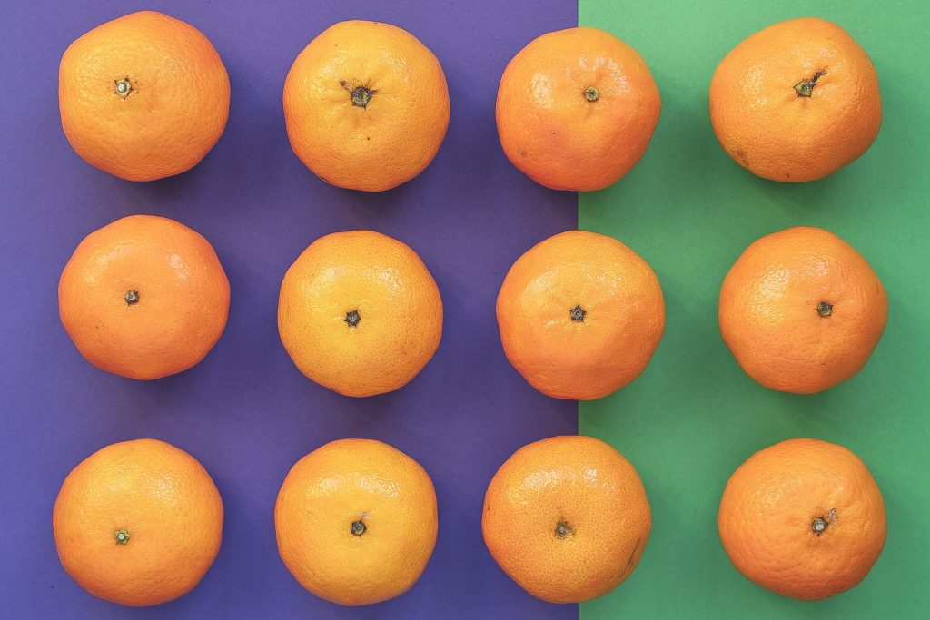
The first thing to keep in mind is the color wheel. Primary colors such as red, blue, and yellow are found at the furthest points on the circle while secondary colors (green, orange, purple) lie between them. To find complimentary colors simply look across from each other–opposites attract! For example, green complements red while blue pairs up nicely with orange. It’s also possible to combine several complimentary hues for a more striking result; such as purple with yellow or teal with pink.
Split Complementary Colors
Split Complementary Colors are an interesting way to mix colors together. When combined correctly, they can create some of the best combinations of colors that make a bold statement. This type of color combination is perfect for those who want to add a unique flair to their decor or design projects.
Split Complementary Colors are created by choosing one main color and two complementary colors on either side of its complement. For example, if you select blue as your main color, then yellow-green and red-violet would be the two complementary shades on each side of blue’s complement – orange. Using this method gives you three different hue families which can provide more depth and interest than just a simple complementary pair. The result is usually much more vibrant than traditional monochromatic palettes, but still maintains harmony between the tones in the overall design.
Monochromatic Color Scheme
The monochromatic color scheme is one of the most timeless, classic and versatile choices for any space. This design style involves the use of a single color, or shades and tints of that same hue throughout an area. Monochromatic color schemes create a cohesive look with great visual interest, making them one of the best combinations of colors to use in your home.
No matter what room you’re designing or what aesthetic you’re going for, there are plenty of ways to incorporate this one-color concept into your interior decorating plan.
Analogous Colors
Analogous colors are one of the best combinations of colors for creating a beautiful and harmonious look. Using these adjacent hues on the color wheel, designers can discover a myriad of stunning looks. From muted pastels to bright neons, analogous color schemes offer versatile options for transforming any space.
The key to utilizing this type of color scheme is understanding how they work together. Analogous colors are those that are next to each other on the color wheel and typically share the same hue family. By utilizing two or three shades with similar undertones, you can craft an environment with an eye-catching palette. To add interest, consider introducing complementary accents in accent pieces such as furniture and décor items to create balance within your design concept.
Triadic Color Scheme
A triadic color scheme is one of the best combinations of colors that can be used to create visually stunning art and design. This color scheme uses three colors which are evenly spaced around the color wheel, creating a balanced and vibrant look. The three colors chosen for this type of palette are usually quite different from each other in terms of hue, saturation, and brightness. Such contrasting colors can bring attention to the work in an impactful way, allowing the audience to appreciate the vibrant combination of shades.
When using a triadic color scheme it’s important to consider which hues will work best together. To create an effective palette you should choose colors that complement each other without over-saturating or clashing with one another.
Choosing the Right Shades
Choosing the right shade of color can make a dramatic difference in how your design looks. Whether you’re picking out paint for your walls, selecting fabrics for your furniture, or choosing colors for a logo, it is essential to understand the best combinations of colors that will work together. Before deciding on any hue, it’s important to think about what feeling and overall look you are trying to convey with your choice. Do you want a bright, cheerful interior? Or do you prefer something more muted and subtle? Once you have an idea of the atmosphere you wish to create, it becomes easier to choose the right shades of color that will bring this vision to life.
Cool Tones
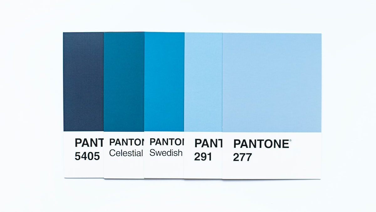
Cool tones are the perfect addition to any design. Whether you’re looking for the best combinations of colors for a room or just want to add a subtle hint of color, cool tones are the way to go. Cool colors like blues, greens and purples can bring feelings of peace and serenity into any space.
When selecting a specific hue, consider both its tone and saturation. Lighter shades provide an airy look while darker tones offer more depth and drama. You can also combine multiple shades of the same color for an interesting effect that is sure to draw attention. For example, pair lighter blues with navy blue accents or mix lavender with mauve in order to create unique contrast within your design scheme.
Warm Tones
Warm colors can often be found in nature and have been used to evoke feelings of joy and happiness. They are associated with energy, enthusiasm and the power of imagination, making them a great choice for many different color combinations. When it comes to decorating your home or office space, choosing the right colors can make all the difference in how a room looks and feels.
When using warm tones in general, it is best to pair them with cooler colors like blues or greens to create balance within the space. This is a classic color combination that works well together without overpowering each other. Keeping one color dominant while incorporating its complementary shade will keep things looking bright and inviting without feeling too overwhelming or chaotic. Using neutral accent pieces such as white furniture will help to bring out both tones while still keeping everything cohesive.
Discover the Perfect Color Combos
Red & Blue
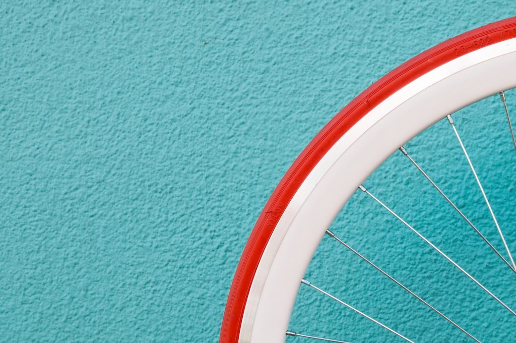
One of the best combinations of colors is Red and blue. Often red is associated with passion, power, and energy, while blue symbolizes knowledge and wisdom. Together in design, these two colors create a beautiful contrast that can be used to enhance any project.
When it comes to using this combination for fashion or home décor purposes there are so many creative possibilities. For fashion, one can pair a statement red dress with crisp white accessories and navy blue heels for an on-trend look that will turn heads. Alternatively in the home you could use pops of red such as cushions combined with pale blues on walls or rugs to create a calming atmosphere that feels both modern and inviting.
No matter what purpose you’re using this color combination for you are guaranteed to get something stylish out of it!
Green & Purple
Green and purple are two of the best combinations of colors when it comes to making a bold statement. This vibrant duo can be used for everything from fashion to interior design, and offers endless possibilities for innovating style. Not only is this combination eye-catching, but it also provides a unique balance between color tones that create an energizing atmosphere.
According to color therapy experts, green symbolizes nature, growth, energy and harmony while purple carries emotional stability as well as ambition and creativity. Combining these two shades results in an atmosphere filled with motivation due to its calming yet stimulating properties. People who prefer this particular blend of colors often enjoy creative activities such as drawing or painting because they find it helps them tap into their inner potential.
When used together in the home or in clothing items, green and purple make a powerful statement that will turn heads wherever you go!
Yellow & Orange
Colors have the power to make a statement, evoke emotion, and bring life to any space. Yellow and orange are no exception. Whether you’re looking for an eye-catching palette for your bedroom or a fun color combination for a graphic design project, yellow and orange deliver high energy and boldness. Here we explore some of the best combinations of these two colors to help you find inspiration in your own designs.
The perfect balance between bright yellow and warm orange creates a cheerful ambiance that is sure to make any room more inviting. Combinations like lemon chiffon with terra cotta, canary yellow with tangerine, or goldenrod with burnt sienna provide both vibrancy and warmth to any space. When used together as accents in textiles or wall art, these colors will keep every room feeling alive without overpowering it.

Pink & Brown
When it comes to design, the best combinations of colors can make all the difference. The combination of pink and brown is a classic color palette that can be used in many different ways. Whether you are looking for something soft and feminine or something more modern and edgy, this color combination has endless possibilities.
Pink and brown together creates a sophisticated look that is both bold yet subdued. It conveys warmth, comfort, and style in equal measure. This color combination looks great in interior design as an accent wall or furniture piece, or in fashion clothing with accessories like jewelry or bags. It’s versatile enough to use on its own. But also pairs nicely with other complementary colors such as green, gray, black, blue, yellow and purple for more unique combinations. The pink and brown color combo isn’t just versatile though; it also carries emotional significance too.
White & Black
White and black are two of the best combinations of colors when it comes to design. The simple, yet effective combination is often used in a variety of different scenarios, from fashion to interior design and beyond. In terms of color theory, white and black create a stark contrast that can emphasize the other colors used in a piece or project. This contrast can also be used to draw attention to specific features or items within the piece.
The use of white and black together can create an air of sophistication for any kind of design. For example, when used in interior design, this combination conveys luxury while still remaining timelessly classic; as well as being incredibly versatile by mixing with almost any other color without overwhelming the space itself. Similarly, in fashion design this combination provides an interesting juxtaposition between bolder statement pieces and minimal looks.
Colorful Possibilities
In conclusion, the best combinations of colors for any project depend on the desired effect. Light and bright colors can create a sense of energy, while darker shades can provide a calming atmosphere. Combinations should be harmonious, balanced, and cohesive to ensure that the result is aesthetically pleasing. While there are endless options when it comes to combining colors, these guidelines will help you choose combinations that will make your projects look professional and inviting.


